
Amtrak列车涂装方案简史
Amtrak列车涂装方案简史
作为50周年庆祝活动的一部分,品牌管理团队成员Matt Donnelly深入研究了Amtrak的漆料色彩和涂装方案。过去的50年里,Amtrak的列车外观发生了许多改变,我们将各个时代称为各“时期”。1971年,Amtrak从12个私营铁路公司购买了客车和机车,开始投入运营。这些列车的涂装色彩各异,并印着原公司的名称。Amtrak没有时间或资金来更改涂装,当务之急是让列车尽快投入运营。从采购二手列车的“彩虹时代”以来,我们已经走过了多年岁月。观看视频,了解Amtrak的涂装演变历程,并抢先获悉即将进行的VII期设计。
显示/隐藏文字稿
When thinking of Amtrak, most people picture a train. Over the past 50 years, we've had different types of trains to help us connect America, and similar to how fashion trends and style trends change over the years, so has the look of our trains. I'm Matt Donnelly of Amtrak's Marketing Department, here to explore the evolution of Amtrak's paint schemes. In 1970, Amtrak was created by an Act of Congress as the National Railroad Passenger Corporation. We took over the operation of passenger train service on May 1, 1971 from 20 private railroads that no longer wanted to transport people. Many railroads participating in this arrangement gave their equipment such as passenger cars and locomotives to the newly formed Amtrak. While there was a logo ready at the start, there was no time or money for the trains to be painted into a common paint scheme, also called a livery. For the first day of operations, E8 locomotive number 4316 received a one-of-a-kind livery for a press event. It wore this unique paint for about a year, making it a short-lived but significant part of Amtrak's history. It was common to see a broad range of predecessor colors throughout our trains in the early days due to the mixing and matching of inherited equipment. It took several years before most of our trains could be removed from service for painting, making it easy to see why this period is referred to as the rainbow era. It wasn't until 1972 that the first full Amtrak livery started to appear, giving Amtrak's trains their own identity. Back then, there wasn't a need for livery nomenclature, and it was model railroaders that started identifying Amtrak's liveries as phases. Amtrak adopted this style of nomenclature and calls this livery Phase I. It features silver passenger cars with large red and blue stripes flanked by white pinstripes through the window band. A white field toward the end of the car held the Amtrak arrow logo. Locomotives were mostly silver with a black roof and underbody, bold Amtrak Red nose for increased visibility, and a large arrow logo on each side. This livery earned the nickname of the bloody nose due to the bright red front of each train. Adaptation to the form factor it resided on was sometimes necessary, as was the case with the RTG Turboliner. Its stripes were set below the windows, and the lack of a red nose set the transition for the next phase. Introduced in 1975, Phase II was a subtle refinement of the passenger car Phase I livery, eliminating the arrow logo that sometimes had to be abbreviated depending upon where windows fell on the cars. Locomotives saw more noticeable change, dropping the red nose and gaining stripes matching the cars. The stripes used then-new retroreflective technology to increase safety. And the arrow logo was now absent from the livery altogether. Overall, these changes made for a more connected look throughout the train. The Phase III Livery first debuted in 1976 on the Rohr Turboliners. This livery has seen numerous variations and adaptations, with a reincarnation in 2015 on the new Viewliner II fleet. The LRC train and AEM-7 locomotives wore similar variants, with a large low slung blue field. The "classic" and most common styling of Phase III was internally known as the 8-8-8 for its equal 8" tall stripes of red, white and blue. A common theme of Phase III is having a more equal representation of red, white and blue in its striping than previous liveries. The most unique adaptation came in 1991 with the Dash 8, a rather large and boxy freight locomotive adapted for passenger service. Its award winning paint scheme was styled to fit its utilitarian body in a bold way, earning it a fan nickname based on a popular cola can from the era. This marked the first time in Amtrak's history that the main Amtrak Red and Blue colors were changed to what we call Amtrak Deep Red and Deep Blue. These new colors continued on to the Genesis locomotive variant of Phase III. The first appearance of Phase IV came in 1993 with the new Superliner II car fleet, resulting in a period of overlap with the Genesis variant of Phase III. Phase IV shares the same Amtrak Deep Red and Deep Blue colors that debuted on the Dash 8 locomotives, applied in a stripe pattern inspired by the American Flag. Locomotives gained a larger presence of silver than ever before, with silver trucks, underbodies, nose and cab areas. This is known as the Intercity Variant, and was most common. A Northeast Corridor variant with gray extending off the roof further onto the sides and nose was applied to some P42s and P32AC-DM locomotives. Phase V debuted in 2000 on the first generation Acela trains. This marked the introduction of a new color palette, with a new primary Amtrak Blue color and the reintroduction of original Amtrak Red. A host of new accent colors were added, originally used in specific combinations to denote the class of service or function of the car. For example, Green was used on food service cars, and dark blue was used on business class cars. This livery soon became common on locomotives like the P42, but it was short lived on conventional passenger cars. Amfleet I cars were the most common type to receive the livery before the next livery evolution, but was also found on express box cars and the RTL III Turboliner train sets. In 2002, Phase VI was introduced on passenger cars, but has only recently been developed for locomotives. The standard look of our trains for a long period was Phase V locomotives with Phase VI cars. The Phase VI passenger car livery was based on an update to the Phase IV livery, adopting the newer color palette, car lettering font and Travelmark logo introduced in 2000. A locomotive variant was announced in 2020 for the first new ALC-42 Charger locomotive expected later in 2021. Amtrak Blue is the primary color, with Amtrak Red used in a more prominent way on the front, and Dark blue on the roof. The Phase VI chargers will also feature a nod to Amtrak's history with a component of the old arrow logo and a section of silver toward the rear. Over the years, other Amtrak liveries have been created that don't classify as a Phase. These include Service Specific liveries providing a more regionalized distinction for routes like the Pacific Surfliner, Amtrak Cascades and Amtrak Midwest. The new Acela II livery on the next generation trainsets shares the primary Amtrak color palette, but introduces new elements like geometric patterns that differentiate the service. Our work train equipment gets high visibility colors like bold lime, and we've also developed celebratory and commemorative liveries like those on our Veterans locomotives. This unique midnight blue livery celebrates our employees who keep passengers moving across the nation all throughout the night as part of our 50th Anniversary celebration. It will be rolling across the system soon, along with 5 other specially painted locomotives. The most historically significant will be brand new ALC-42 Charger #301, currently under construction, which will wear the Day One livery. The new Chargers will be numbered starting at 300, and Road number 301 was chosen specifically to wear this livery because of it being a one-of-a-kind created for Day 1 of operations. It's expected to be delivered later this year, and enter revenue service on our national network after testing is complete in the Northeast Corridor. With new Charger locomotives arriving soon and the planned replacement of Amfleet I cars, the opportunity for a new comprehensive and forward-looking livery is upon us. Here's a sneak peek at what will be Phase VII, bringing a greater sense of modernity and cohesion through our trains with efficiency, safety, and wearability in mind. Thanks for joining me on this review of Amtrak's paint schemes. We're looking forward to what's to come in the future.
此视频展示了六辆特别涂装的50周年纪念列车效果图,它们由机械部的Devon Parsons、Blair Slaughter、John Skalski、Seth Geist、John Dzedzy,车辆工程部的Krischen Temple,以及营销部的Matt Donnelly携手打造。
显示/隐藏文字稿
Matt Donnelly: I'm Matt Donnelly of Amtrak's Marketing Department, and I'm pleased to be joined today by some of Amtrak's past and present creative minds who've played major roles in the development of our iconic liveries over the past 50 years. Ralph Dolinger, Cesar Vergara and Blair Slaughter sit down to talk about what goes into the creation of those liveries from the first days of Amtrak's operation to our upcoming 50th anniversary, commemorative locomotives. Ralph Dolinger was Amtrak's seventh employee hired in March of 1971 prior to the start of operations. He worked in the engineering and design group until 1989 and is here today to talk about what it was like in those early days of the company.
Ralph Dolinger: Lippincott & Margulies provided the graphics for Amtrak. The logo did not provide the color. They didn't provide any of the details. They provided some early supervision, I guess for a couple of locomotives that never was utilized. It was a black locomotive and those things didn't exist, you know? So it was all promotional. And by the time when we got on board Amtrak was just trying to get this, "Who's Amtrak?" So they had to get the Amtrak face out there and that was it. It was quite a while later when we actually had enough people get together and go, "Okay, now we've got to get the equipment with the Amtrak name on it." You'll see, I've got pictures of them, where they just stuck an Amtrak logo down low on the corner of the car. It was just trying to get the name out there.
Matt Donnelly: Amtrak started with all second-hand equipment, and didn't have its own facilities or workforce to do paint work. It took years to shed the rainbow image of predecessors that gave up on passenger train service.
Ralph Dolinger: Remember we had contract shops all over the place doing work. They didn't have any drawings so you'd see the arrow angle, the guy tried to stick the arrow, the feather, you know, in a location that wouldn't fit so they would bend it .You know, it was chaotic. Not only didn't they have drawings, we didn't have guys to draw. We would get Xerox's out of Rail Car Spotters Guides, no kidding, and we would mark them up, hop on a train, go down to Hamburg Industries, and we would walk around with the guys with a magic marker to write on them and do the interior and the exterior on the fly. That's how small Amtrak was.
Matt Donnelly: As Amtrak grew, its image evolved. Efficiencies were gained by standardizing designs and materials to better fit its diverse fleet.
Ralph Dolinger: You know, one set of cars had smaller areas and everything would squeak down and then there'd be a car that had a big wide area and then the arrows would land in an odd spot. And then it just kept, this is just getting worse. So as we kept evolving, we need the red, white and blue. You've quickly gone from a hodge podge of decals handed out for the original shape, finding it doesn't work with the equipment, then evolving a system and then working up from there. So it just kept growing. So we used a solid pigmented red and blue and kept a white stripe. As soon as we were able to get that done, bingo we were in. So then we, then the design immediately went to, "We'll use the white area for the information." And then you had the car number and what it was: Coach, Diner, Lounge or something like that at the doorways, 'cause that's where you're getting in the car.-
Matt Donnelly: Blair Slaughter has an impressive 32 year career with Amtrak and is still part of the Rolling Stock Engineering Group today. As new equipment orders came in the 90s, so did new livery designs and for the first time, Amtrak changed its signature red and blue colors.
Blair Slaughter: We looked at the opportunity to shift those to a truer red and a darker blue more toward the navy. Again, looking at the colors of the flag and those being very bold colors in themselves. With all this new equipment that was going to be coming on, you know, changing away from the F40s, which had been the stable locomotive of Amtrak for years, it was a dividing point. So we were like, we're not gonna just divide with the equipment, we're gonna divide with the colors and the schemes and everything. The Dash 8s, they were a freight locomotive, very boxy, very cumbersome looking locomotive. We knew, to make that thing work in our world, we need to be as bold graphically as that locomotive was coming at you. There were variations of what became the Dash 8 scheme and it was you know, it's like it's not quite there, it's not quite there. And when we hit it, Cesar looked at it and he said, "I think that's it!"
Matt Donnelly: Cesar Vergara, Amtrak's Chief Designer between 1990 and 2000, joins us to give insight on his award-winning design for the Genesis locomotives.
Cesar Vergara: I really wanted to come up with something that would transition very well. And I will never claim to have invented this dot pattern that goes from big to small. In my recollection, nobody in the railroad, certainly passenger rail, had not done this. And that was the idea I came up with, working with manufacturers, and can this pattern, they called it the fadeaway. It's like a sprinter, in a marathon, he or she has crossed the line and the fadeaway dots looks like it's the ribbon that is fading in the speed of the moment. So it kind of like, trying to inspire, trying to make something that people would be inspired by and think, "Well, that's a really nice looking feature." It absolutely met the goal of having the B end of the locomotive not mismatch to any of the heights of the cars' stripes which are at different heights.
Matt Donnelly: The Genesis project was monumental for Amtrak because it wasn't just a new livery being designed, it was an entire locomotive.
Cesar Vergara: We did different width stripes, we did different ways of treating the transition from the nose to the car body, but it all was all in the same flavor. The only exception was the red one and that is the way we created the scheme for the Genesis. But of course, it all started with the shape.-
Blair Slaughter: As the 90s came to an end, Amtrak was pacing toward its first truly high speed trainsets, not MU cars like the old Metroliners. And that was going to be another watershed moment for Amtrak.
Matt Donnelly: This was more than developing a new livery for a new train. It was part of a major rebranding effort resulting in a new color palette, new fonts, the new Amtrak Travelmark logo, and the creation of the word, "Acela," a combination of the words acceleration and excellence.Blair Slaughter: There is no mistaking the Acela trainset when you see it or anything about it. We needed a simpler scheme to take, instead of taking Phase V across the country, because it was a complex and very expensive scheme to replicate across different fleets. So we developed what became the Phase VI, which was very much the Phase IV, with the new blue. And then, so that was used in conjunction with what we know as the Phase V locomotive, which got its appearance from the Acela. We were asked to look at, as we had gotten the cars into Phase VI, "What can we do to better tie these back together?" And so we did several concepts. The problem was we were so deep into the orders for the new locomotives, and we'd gotten so many of the Phase V that we would have would have ended up with a disjointed look.
Matt Donnelly: As been a common element throughout the history of Amtrak, whenever there's a new equipment acquisition it lends itself to a livery evolution and the new Charger locomotives is really no different. We've had Phase V and Phase IV for about the last 20 years, and now's our opportunity to get those liveries back in sync as best as possible. And knowing that we want to evolve to a larger more comprehensive, consistent livery package for what'll be our legacy equipment and then the new fleets that are to come in the future, we were able to make Phase VI work with the existing cars and be that transition for Phase VII.
Blair Slaughter: Now, with the 50th Anniversary, Matt came at me with this, "Let's do a Dash 8 scheme." And we literally took the CAD drawing of the original paint scheme that we gave GE, and lifted that right off, then things had to scale differently, but I was actually amazed when we started doing it, how much of the original intent we were able to just bring right over.
Matt Donnelly: So there's a lot that's coming on the horizon. Amtrak's had an extremely colorful history and we're looking forward to the next 50 years.[Upbeat Music]
在这里,我们与曾经或正在参与这些引人注目的涂装方案设计的员工齐聚一堂。从回顾寒微的开始一直到展望未来的发展,我们通过这一过程了解到了在过去50年当中,作为一家美国铁路公司,在成长和发展进程中所面临的挑战、迸发出的创造性灵感,以及做出的改进。
ALC-42列车正在全新打造,而五辆P42列车则在Beech Grove, IN工厂进行生命周期维护计划。我们正在陆续涂装机车,这些机车是该计划的关键。团队认真讨论了涂装方案,以展现Amtrak的风采,在过去50年间,Amtrak始终是美国主要运输供应商,未来也是如此。以下是我们得出的方案:
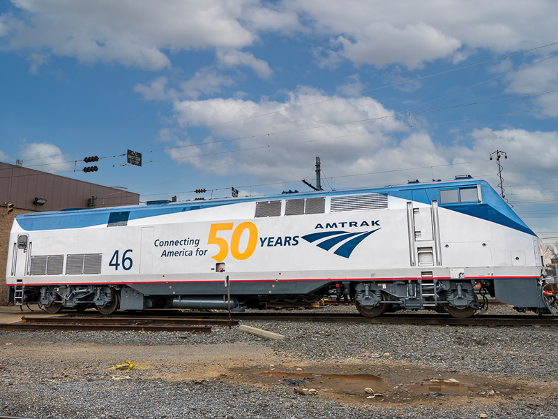
P42 #46“V 50期”
制造商:通用电气,1997年
最高时速:110英里/小时
马力:4250
过去的二十年里,我们的机车主要采用V期涂装方案。我们在两侧新增了“畅行美国50年”巨幅图案,为熟悉的 "蓝色波浪 "涂装增添了个性色彩。#46号列车也恰好是首辆在1月投入使用的50期列车。
P42 #46“V 50期”
制造商:通用电气,1997年
最高时速:110英里/小时
马力:4250
过去的二十年里,我们的机车主要采用V期涂装方案。我们在两侧新增了“畅行美国50年”巨幅图案,为熟悉的 "蓝色波浪 "涂装增添了个性色彩。#46号列车也恰好是首辆在1月投入使用的50期列车。

P42 #100 "午夜蓝"
制造商:通用电气,1997年
最高时速:110英里/小时
马力:4250
这辆深蓝色的靓丽列车涂装简洁而醒目,此涂装是为了感谢我们的员工,他们24/7提供服务,以帮助乘客畅行全美。反光白边和超大图形是设计亮点,与列车的标准涂装形成鲜明对比。这是P42 #100第二次进行特别涂装,此前在庆祝Century Express时,它被特别涂装成一个大型马尼拉信封,贴着硕大的邮票和邮戳。
P42 #100 "午夜蓝"
制造商:通用电气,1997年
最高时速:110英里/小时
马力:4250
这辆深蓝色的靓丽列车涂装简洁而醒目,此涂装是为了感谢我们的员工,他们24/7提供服务,以帮助乘客畅行全美。反光白边和超大图形是设计亮点,与列车的标准涂装形成鲜明对比。这是P42 #100第二次进行特别涂装,此前在庆祝Century Express时,它被特别涂装成一个大型马尼拉信封,贴着硕大的邮票和邮戳。
P42 #161 "I 50期"
制造商:通用电气,2001年
最高时速:110英里/小时
马力:4250
Amtrak的首期涂装方案是1970年代的标志性设计,十年前的40周年纪念日上,P42#156号列车首次重现了该涂装。它立即成为粉丝的最爱,并获得了大量支持。156号列车已经退役,因此我们只能在5-0列车上重现这款复古经典涂装……但我们会不断推陈出新。
P42 #161 "I 50期"
制造商:通用电气,2001年
最高时速:110英里/小时
马力:4250
Amtrak的首期涂装方案是1970年代的标志性设计,十年前的40周年纪念日上,P42#156号列车首次重现了该涂装。它立即成为粉丝的最爱,并获得了大量支持。156号列车已经退役,因此我们只能在5-0列车上重现这款复古经典涂装……但我们会不断推陈出新。
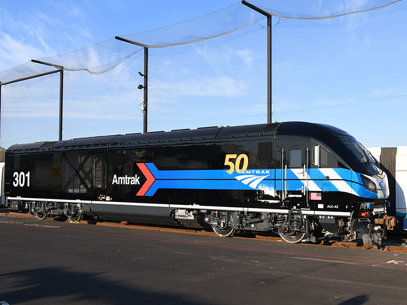
ALC-42 #301 "1日"
制造商:西门子交通公司,2021年
最高速度:
马力:4200
1971年5月1日,America's Railroad运营首日的新闻发布会上,E8 #4316以这款简陋的一次性涂装首次亮相。火车头两侧各有一个细长的箭头标志环绕车头,车头上有老虎条纹。对于以二手列车起家的铁路企业来说,50年后,将该涂装重现在Amtrak的最新列车上再合适不过。
ALC-42 #301 "1日"
制造商:西门子交通公司,2021年
最高速度:
马力:4200
1971年5月1日,America's Railroad运营首日的新闻发布会上,E8 #4316以这款简陋的一次性涂装首次亮相。火车头两侧各有一个细长的箭头标志环绕车头,车头上有老虎条纹。对于以二手列车起家的铁路企业来说,50年后,将该涂装重现在Amtrak的最新列车上再合适不过。
P42 #108“VI 50期”
制造商:通用电气,1997年
最高时速:110英里/小时
马力:4250
十多年来,VI期涂装一直是我们的标准客车涂装,但在交付P42时,出于时间和成本的考虑,并没有应用于P42列车。为了庆祝50周年,同时展望未来,设计现代化的VI期P42涂装是个好主意。
P42 #160 "Dash8III期"
制造商:通用电气,2001年
最高时速:110英里/小时
马力:4250
90年代早期,Dash8列车系列采用了升级版的III期涂装,并获得殊荣,这也是Amtrak最被人津津乐道的涂装设计之一。有一些挑战需要克服......在退役之前,Dash8均无需喷漆,而且这些机车如今用于货运列车,或停在车站,几乎不再牵引客运列车。此前,一些模型铁路爱好者曾经升级了此涂装方案,并应用于按比例缩小的P42上,团队向Blair Slaughter(该涂装的原设计师)提出挑战,要求将其应用于1:1比例的P42。此项大胆设计原本只用于Dash8列车,但当我们看到它稍作修改后,即可呈现出色的适应性后,感到非常惊喜。
